Chase Auto
As a member of the Chase Auto team, I oversee projects across the entire consumer funnel, including finance, shop,
prequalification, onboarding, loan management, and more.
Chase Auto
As a member of the Chase Auto team, I oversee projects across the entire consumer funnel, including finance, shop,
prequalification, onboarding, loan management, and more.
CHASE AUTO
Making auto financing more accessible for all
As a Senior Content Designer for Chase Auto, I specialize in creating clear, user-centric experiences that drive key business outcomes. My work spans the entire customer journey, from initial interest and onboarding to loan management and re-engagement.
In my role, I lead content design efforts for projects of every size, such as the introduction of auto refinancing, a valuable new product that expands Chase Auto's already diverse portfolio. I also play a crucial role in improving top-of-funnel experiences, like expanding prequalification and capital-light revenue efforts.
Throughout every project, I collaborate closely with cross-functional partners in research, product, marketing, and design to define problems and build effective solutions for millions of customers.


Checkr
Sign-up optimization case study
Checkr
Sign-up optimization case study
increasing conversion for self-serve customers
Content Design | UX Design | User Research | User Testing | Brainstorming
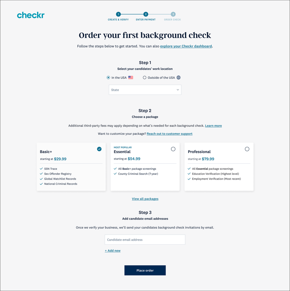
We prioritized a user-centric approach to transform our core sign-up flow into a more self-service experience. This included a critical review of the existing flow, which identified these key areas for improvement:
Low MVR adoption: Only 3% of self-serve customers utilized Motor Vehicle Record (MVR) checks, hindering additional product adoption
High funnel drop-off: A concerning 26.6% of users abandoned the sign-up process, indicating significant friction for users
Information overload: Users felt overwhelmed by the amount of information presented during sign-up
Lack of transparency: Progression and status throughout the process were unclear
Original state


The biggest drop-off in the conversion funnel occurred between the payment and ordering steps at a staggering -21.4%. This critical insight identified a prime opportunity for us to intervene and significantly improve conversion rates.
By implementing quality targeted content and design updates, we addressed the underlying reasons for customer abandonment and achieved multiple goals:
Increased overall conversion: By reducing friction at checkout, we encouraged more users to complete their orders
Boosted order completion rates: We nudged hesitant customers to finalize their purchases with confidence
Drove higher order value: Strategic design elements and high-value product education encouraged customers to add additional products, increasing AOV.
Research
We conducted a thorough comparative analysis of adjacent product sign-up flows to help our team better understand existing conversion processes. The products looked at included Duolingo, Gusto, AirBnB, Squarespace, and Workable. I also shadowed multiple customer interviews, and conducted my own, content-focused research via Lyssna.

This research, along with my user feedback and testing, informed multiple changes to the customer journey map, including:
Overlapping flows — We streamlined sign-up and onboarding to create a contiguous process that isn’t jarring, overwhelming, or isolated
Value generation — We added multiple points of personalization, education, and social proof to increase value in place of teasers and demos
Smaller user tasks — We reduced the amount of information being collected per page, splitting up inputs into smaller, more digestible tasks
Solution
When designing our solution, we focused on isolating the required information to create an effortless user experience. Other major changes included:
Reducing body content and unactionable language, while improving high-value education and instruction
Removing unnecessary fields, enhancing the use of whitespace, and prioritizing the presence of links
Emphasizing complete packages, simplifying their presentation, and pre-emptively addressing customer concerns
Improving and validating CTA language and directing it straight into the core product
Impact

Figure 2 — Conversion rates of sign-up flow
We saw all of our goal metrics increase after thirty days of launch. We also saw an overall increase in activation rates, as well as:
Increased conversion rates across our funnels, doubling the number of user completions (see figure 2)
Positive conversion beyond our prioritized flow (see figure 3)
A positive impact on all MVR metrics, including reduced time-to-order (see table 1)

Figure 3 — Average weekly number of customers completing each step
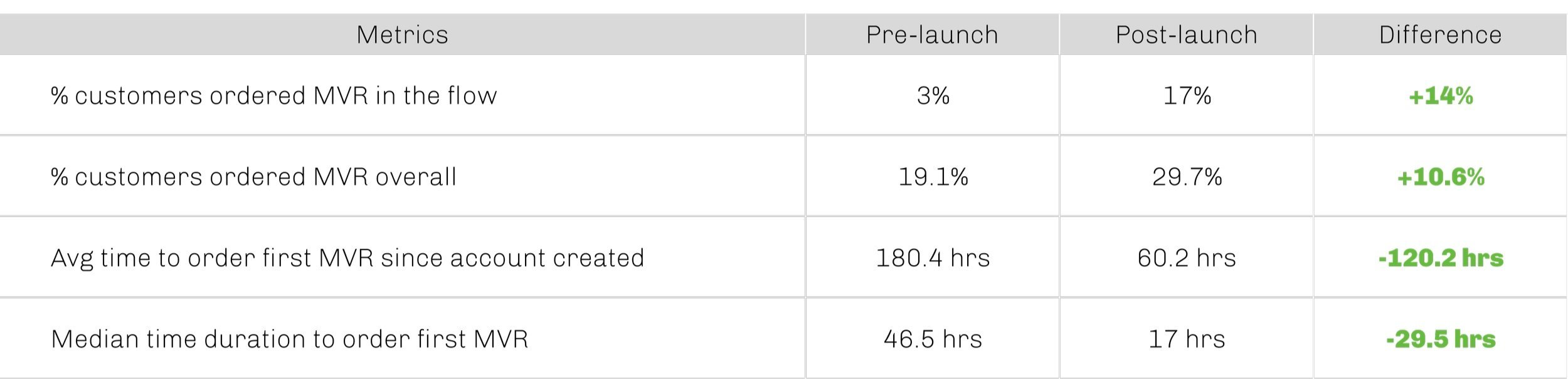
Table 1 — Overall MVR add-on performance
META
Embedded across several teams, I covered multiple products including Rights Manager, Music Partner Experiences, and Instagram Shops.
META
Embedded across several teams, I covered multiple products including Rights Manager, Music Partner Experiences, and Instagram Shops.
Rights Manager
Democratizing copyright management:
I played a key role in transforming Rights Manager from an enterprise-level tool to a platform empowering small businesses and independent creators. While part of the team, we completely revamped the user interface (UI) to create a seamless experience across all user levels. This included a brand-new onboarding flow and streamlining all existing flows.
We also introduced several crucial creator functionalities, including:
Video protection to safeguard content from unauthorized use
File management to simplify the storage of different file types
Creator Studio integration to create a more holistic experience from post to protection
Monetization tools that empower creators to earn more
Ad preference controls to help maintain control over ad placement
Additionally, I contributed to projects like:
Clear copyright violation messaging that ensures copyright owners and everyday users understand copyright policies
Educational workflows for rights holders to promote best practices for publishers, labels, businesses, and beyond
New user education to help guide novices through the platform effectively and maximize their value
*Please note that some casing is inconsistent as these screenshots were taken during a title case to sentence case migration.
While most of my work lives within the product, I spent quite a bit of time creating new, external messaging too. That content can be found on the following sites:
rightsmanager.fb.com | facebook.com/creators | Instagram.com/features/shopping | facebook.com/formedia


T-Mobile 1
T-Mobile 1
[ Customer experience launchpad ]
At This Place, we recognized that T-Mobile’s siloed and disjointed work streams were leading to inconsistent customer experiences. To help bridge this gap, we developed the T-Mobile Customer Experience Launchpad, a revolutionary framework built on collaboration and cross-functional feedback.
The Launchpad was meant to foster a centralized environment where creative departments could work together seamlessly. This sought to improve the creative process and ensure a cohesive brand experience across all touchpoints.
What it offered:
Cross-functional collaboration tools: A breakdown of departmental barriers with shared workspaces, real-time communication channels, and multi-department thinking and ideating opportunities.
Standardized feedback loops: An ability to ensure all voices were heard via a structured feedback process that incorporated research, data, and insights.
Customer journey mapping: A clear understanding of the customer journey at every stage, allowing for targeted and impactful creative solutions.
The T-Mobile Customer Experience Launchpad was more than just a framework; it was meant to be a cultural shift that unified the company’s creative vision while prioritizing a seamless and delightful customer experience.
T-Mobile 2
T-Mobile 2
From legacy plans to future-proof solutions: Crafting a unified selection process for T-Mobile
As the T-Mobile and Sprint merger approached, we created a mobile experience designed to bridge the gap for transitioning Sprint customers. This interactive guide focused on T-Mobile's key benefits and demonstrated their value propositions to users. It also presented new plan options clearly and intuitively, simplifying the selection process and helping customers transition to the right plan.


Blue Sky
An all-in-one travel experience
Blue Sky
An all-in-one travel experience
Hacking travel with an all-in-one super app
At This Place, we believed in thinking outside the suitcase. That's why we developed a revolutionary, highly personalized travel app to showcase our blue-sky thinking to Alaska Airlines. I co-led the project with my Product Design partner and sought to streamline every step of the travel journey.
Imagine a world where you can ditch the app overload and plan, book, and manage your entire trip from a single, intuitive platform.
Book flights, hotels, and ground transportation seamlessly, saving time and eliminating frustration
Revolutionize the pre-boarding experience with "Gate Chat", which allows people to swap seats for a smoother boarding
Beat the food lines with "Terminal Ordering", which pre-orders meals and schedules pick-ups
Pack accordingly by checking the dimensions of your luggage against the space available
We even integrated features like dynamic backgrounds and information to keep people on top of everything they need, right when they need it (think passport at security, boarding pass at the gate, reservation details at the hotel)
We sought to put a seamless vacation at your fingertips, so people could focus on what truly matters – creating lasting memories.


Boeing
Boeing
Revolutionizing the aviation experience: A modern marketplace and streamlined website
At This Place, we envisioned a complete transformation for Boeing Global Services through a cutting-edge aviation marketplace and a modern, user-friendly website.
For the marketplace, we spoke to consumers of all types and utilized their feedback to create an experience that:
Connected aviation businesses of all sizes to foster new opportunities for a wider range of aviation customers
Put customer stories on center stage to highlight real-world experiences, build trust, and inspire users
Simplified the purchase process to automate and streamline workflows, while making the acquisition process nearly effortless
For their website, our team:
Overhauled their online presence via a modern design that created a positive first impression, focused on their storied history, and enhanced their brand image
Created an open and accessible experience that catered to users of all types
Overall, the project streamlined the customer journey, fostered deeper engagement, and positioned Boeing Global Services as a leader in the aviation industry.


UX overview
UX overview
Just to name a few more...